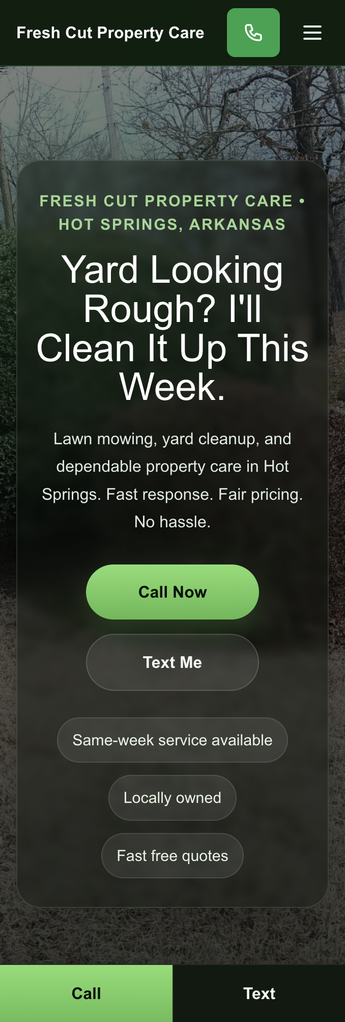
Concept page · Restaurant & hospitality

Restaurant websites that sell the room — not the confusion

Most restaurant homepages bury the menu, hide hours, and load like it is 2012. This page explains how a redesign fixes that: mobile-first layout, obvious reserve and order paths, and photography that matches how guests actually decide where to eat.

Local service website preview — clear structure and mobile-friendly layout

Before: friction on the first tap

PDF menus, tiny tap targets, autoplay music, and buried hours. Guests bounce to the next tab — and you never know they were interested.

Polished brand website preview — strong typography and hero presence

After: menu, hours, and proof up front

One scroll tells the story: what you serve, when you are open, how to book or order, and social proof — all thumb-friendly on a phone.

What we actually change

  • Information hierarchy — hours, location, and menu links in the first screen, not three clicks deep.
  • Speed and Core Web Vitals — compressed images, modern fonts, and no heavy sliders that tank mobile scores.
  • Reservation and order CTAs — consistent buttons that match how you take business (phone, platform, or native form).
  • Seasonal updates you can own — simple patterns so your team can swap specials without breaking the layout.

See it in a live sample layout

The Southern Diner Concept and Brick & Ember portfolio demo show the same structure we use for real clients: hero, services / menu blocks, gallery, reviews, and a strong closing CTA. Open either link on your phone — that is the bar we build toward.

Want this for your kitchen or dining room?

Send your current URL and a few photos — I will reply with a short teardown and how a redesign could move more covers and takeout orders.